I met up with the clients and discussed the project in more detail to figure out what they wanted. My job was to create an illustration that could be used for the front of the flyer, for some large scale standing banners for events, and to be used within the website as the banner and for other sections of the website.
The wanted the illustration to be of an scene of the outdoors, with mountains, walkers, campers and cyclists. They wanted me to put my own twist on it as much as possible and try and apply my own character style to the themes as much as possible but make sure it clearly communicates ideas about the outdoors.
I wanted to produce the final image as a screen print so I could apply a colour blend effect, I thought it would be a good way to experiment with good outdoor colour combinations. The clients where happy with my suggestions so my next step was to get sketching and figure out how to compose the landscape mountain scene in a tall portrait composition suitable for the flyers and standings banners.
First Sketch Ideas:
- These are the first initial sketches that I sent over to the clients for some feedback on the design. With the project being for a big company and the clients where willing to pay good for the design I had to make sure I got the images how they wanted, and they had quite a specific idea of what they wanted so I wanted to it to meet there intentions.
- I was also warned that the clients wont except work that doesn't meet there expectations because of how much they are paying (which is totally understandable). So I had to make sure I got the design right. And because I was screen printing the final image I was better to get feedback at earlier stages of development because I was a lot easier to make the amendments.
Feedback from the client:
Developed Sketches:
Final Drawing
- I refined the drawings with the feedback from the clients and then worked towards making the final image that I could construct into a screen print.
- I sketched the design out several times on large A2 sheets of paper until I had a composition I was happy with.
Final Outline
Final Positives:
- Here is the final image image separated into different colour layers for screen print.
- I scanned in the drawings and edited it on photoshop, I coloured it in with the rough colours that I wanted it to be so I could figure out how to separate the layers.
Screen Prints:
- Here are the individual layers with the different colour blends.
- It was a 4 layer screen print so getting the alignment accurate was vital for the design.
Final Scans:
- These are scans of my favourite colour blends from the final screen prints. These are what I sent over to the client for them to choose from for the final flyers/banners.
Final Printed Flyers:
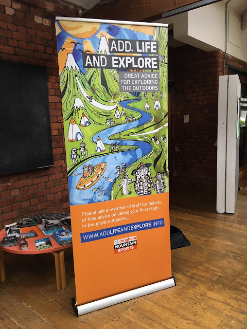
Banner/Stands:
- These are the final printed products that they used at the events.
- Its interesting to see how my design works printed with the text and information. I like to see how my designs can be more informative and communicate specific ideas of the outdoors.
- I think screen printing was a good route to take for this kind of project. The colour blending gives it a good unique visual identity that the clients where happy with. And giving them a choice of the final colour blends was a good way to engage them with the project.
- Overall I think the most valuable thing I learnt from this brief was the interaction with clients and how you need to be willing to twist your skills around the specific needs of the client.


No comments:
Post a Comment