Brief:
I was commissioned to design a shop sign/logo for a new barbers shop that was opening. It was for my cousin 'Cal Faulds' so we had discuss and decide on a good name for the shop that would suite the brand design. Cals Barbers... Cals Cuts... Cal Faulds Barbers... Faulds Barbers...
- He wanted the design too mimc the traditional and classy barbers shop aesthetic, so I had to hold back on the vibrant use of colour and characters to what I would have liked to create for the shop sign.
- He wanted a the design to be almost like a logo that he could use in other areas of the shop, helping him create a good brand identity that people will start to recognise.
- The hardest part about this project was working with a simple and organised logo design that was heavily type orientated - I was much more used too working with heavily image/illustrative based designs. This brief really felt like I was picking at a totally different skill set too my usual.
- I also HAD to use illustrator to create my finished product - This is because the shapes had to be completed as vectors in order to get the final large scale sign printed. I needed more practice working with illustrator and vectors so this was good practice for me.
- He sent me these logo ideas too point in the direction he was looking for. He wanted a traditional barbers logo that was symmetrical and involved some icons that represented a barbers shop. Include icons like - Scissors, comb, cut throat razor, clippers, hair, beard ect...
- He wanted the colour scheme to be dark grey, white, turquoise and black. This was to match the interior of the shop that he had started to decorate. I was maybe not the colour scheme I would personally have used, but this was the design he wanted too pay me for - so these colours where how it needed to be so I had to make it work.
- I had enough information and references to start creating the final sign so I started sketching some ideas to send over to him...
First Ideas:
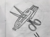
- This is the sketch that my cousin liked best, he liked the clippers and scissors in the centre, and the symmetrical arms either side.
- This is the design I would base the final sign design on - I would need to make neat finalised drawings of the arms and clippers that could be translated into illustrator - and also choose a digital typeface that works well with the images.
Final Outlines:
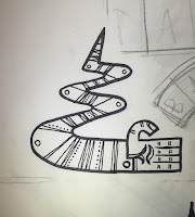
- These are the final pen drawings I scanned in to be used as vectors for the final designs. My cousin really liked how I drew the clippers with long exaggerated clipper end, also how the wire made a loop underneath gave good decoration to the image.
Type experiments/variations:

- Choosing a typeface was very difficult (probably the most tedious part of the project) I used dafont.com to find a typeface - there was lots of potentially good type faces but the one that stood out for me was called 'Megapolis' it had everything that we where looking for - it was traditional and classy but had a modern twist to it, it was clear and readable and wasnt overcrowded with flicks and details. It worked best in plain white with no stupid outline or drop shadow.
- It took a lot of trial and error getting the colours right, and a lot of backwards and forwards communication with my cousin - he had a very particular idea of how he wanted the design so was important to get it right. The toxic green didn't work well, the softer turquiose worked much better with the dark grey, black and white. After a long time making final adjustments to the arrangement and spacing, I was finally happy with a finished design...
Final Digital Design:
Finished Printed Shop Sign:
- I found this project very rewarding to work on, Its so different to my usual outcomes I enjoyed seeing how my skills can be applied to a more formal and logo like business design. Its a good thing to add to my portfolio and demonstrates a totally different type of project I could work on.
- I liked seeing the large shop sign printed it looks smart and professional - I will hopefully get involved in some shop/brand identity work like this - I would also love to combine this sort of project with my interior spray painted mural work - and also look at what other parts of the business I could apply my design work too.
- The finished sign looks smart and professional but my visual identity is still clear within the design which i'm pleased about. I wanted the design to look classy and traditional but not totally boring so i'm glad I still managed to my own twist on it.
Opening Times Sticker:
- I also created an opening times design to go in the shop window, it had a matching type face and I included the image of the scissors/clippers from the finished sign - i'm still in the process of getting this printed, it needed to be on clear vinyl background so you could still see through the glass. I was struggling to get the right settings on illustrator for a transparent background and the company we had been using to get the main sign printed where being un helpful, im currently looking into other places to get the sticker printed.
Lino Print Design:
Sketches...
Finished Lino Print...
- I made a lino print that matched the characteristics of the sign of the shop, I made this for my cousins birthday I framed it and to go up inside the shop. He was really pleased with the design - he had been asking me for prints to put up inside the shop for a while so I thought I would surprise him with a one off 'Faulds Barbers' lino print. I made sure it involved the clippers, scissors and long winding arms just like on his logo.
- We keep talking through further design ideas we can work on for the shop, the next thing will be stencilling his logo onto his wooden floor where the seating areas is. Finding other areas of the shop that I could apply my illustration skills to was beneficial to my practice because shop interior design / decoration / murals etc is a direction I want to keep pushing my practice.


No comments:
Post a Comment