The Brief:
- 'Creative Concern' asked me if I was up for doing some live illustrations as part of project communicating sustainability.
- They where doing a presentation and a workshop at a conference in London and they wanted some live illustrations to be produce alongside it.
- The illustrations had to talk about a number of different ideas about sustainability that are spoken about in the presentation.
- There where 8 different points that needed illustrating and the idea was to have four plain A0 boards that would each get covered with 2 of the points.
- The brief gave me a number of different examples/images that could help me explain each of the ideas.
- They wanted the drawings to match the brand identity colours so I matched the colours as best I could with the specific inks that I used and order a fresh set of pens ready for the day. I also took a range of my own colours
- They also gave me some visual references to work from, It got me thinking about how I could apply my own illustration techniques to simple and linear, diagram style illustrations.
Sketches:

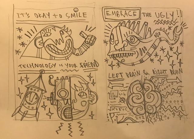
- I made some initial sketches to take with me on the day so I had a good idea of the layout.
- I took some good pointers from the brief as a starting point for the drawings.
Illustrating the points:
- Make the global local - A community of people stood on a globe, sun shining
- Reward and celebrate - A trophy, champagne popping, firworks
- Build your tribe - A group of connected characters with matching features and patterns
- Progress matters - An acorn growing into a tree, a graph suggesting progress, I needed some visual reference for this because was unsure...
- Its okay to smile - A character with a big smiley face
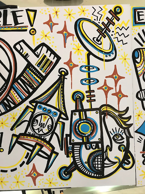
- Technology is your friend - A little rocket character, half robot half human face
- Embrace the ugly - A big ugly fish/slug character
- Left brain and right brain - Creative and mathematical sides of the brain, i used this picture to help influence my design...


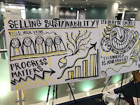
- On the day the arrangement of the boards changed from portrait to landscape, and also 3 boards instead of 4. This meant I had to quickly figure out a slightly new composition - also didn't want to squeeze 4 different board design onto 3 so decided to get rid of the first initial design and just work with others.
Live Drawing:
Board 1:
Board 2:
Board 3:
- Working with more specific and explanatory illustrations in an almost diagram like composition is a totally different approach to what I have been doing with other commissions.
- Working in this way has opened up some other possible directions I could take my illustration skills.
- I liked seeing how my work looked in a more professional environment with such specific content - a lot of my recent work has been driven by own interests in design - so this felt like a more commercial and formal project.
- Aesthetically i'm really pleased with the work - I like how the drippy graffiti markers look when applied to this kind of design - its a very different approach to what I would usually take with this media.


No comments:
Post a Comment