Mics Chilli Packaging:
- Its interesting to see his rough designs in transition to the final labels, photoshop is a vital tool when creating packaging, to apply all the appropriate information, to get the right dimensions and composition, make it mass producible and professional.
- I like the use of character that he uses consistently across the designs, and the way the composition of the imagery matches across all of them, it helps tie them together as a series of products.
- I like how the different types of sauces have a different theme, with a colour theme appropriate to the sauce, it works really well.
- Its really interesting to see the flat designs for the labels before they are rapped around the bottles and the sorts of shapes you would need to work around if you where applying illustrations to bottles.
More Bottle Designs...
- His visual qualities work really well applied to products, He uses lots of bold symetrical imagery, icons and patterns that is well composed, I like how he gives the edge of all the labels the patterned edges, it adds the personality of the products as a whole.
- I liked seeing the imagery he created first before applying it to the labels.
- How he made separate floating images and then built them up into the compositions for the labels.
Pint Glasses...
Illustrated beer glass designs for a Mexican brewery called Medelo.
- I thought this project was really cool, I like how full the composition is with line work, its a really good example of how illustration/drawing can be applied to a product. I would like to see how I could take a similar approach with my project.
- I like the long compositions that rap around the bottle, again with a series of matching designs but where the imagery explores a different theme.
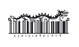
Illustrated Bar Codes...
- This a really unique way off adding even more personality to the products.
- I like how he works with the lines in the barcodes and turns them into little illustrations that suite the themes.
- Its a really nice touch and it make the products characterful and unique - a good selling point for the products.
- I especially like the fish, how he uses the code as part of the image, rather than just building imagery onto it.
Mural for DOMA restaurant...


- I like this mural he did for a Korean restaurant called 'Doma', its is inspired by korean tiger folk art and fables.
- I like the traditional visual quality he creates in the piece, especially when seeing it photographed above the restaurant (below), it really suites the theme of an authentic Korean restaurant.
- The concept works well how he tells a different story within the singular characters. Giving them different gestures and objects and then balances them out loosely filling the composition.


No comments:
Post a Comment