Thumbnails
I started by taking some of the objects and themes from the editorials and see how I could change them and mix them up in different compositions more suitable for a print. I wanted the designs to be shape based with bold sections of printed shape, and too reduce the amount of line work in my designs. I looked at how the images could be combined with shapes and pattern. Using a coloured pencil in the roughs helped me to think about how the images are contained and also how the different layers of the print could work. The head that opens up into a peyote brain is one I particularly like from the above, I feel like at has more of a concept and works to explain things about Huxley. Also the peyotes can make a really cool brain shape!
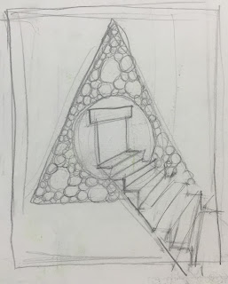
I liked experimenting with the peyote pattern within different shapes. I think this pattern could be really effective screen printed, if overlapped with shapes or other lines. Or even a full bleed page of peyote pattern... I just find it fun to work with, but I want to see what other imagery I can come up with and not let it take over my entire project, given that I used it for each of my editorials.
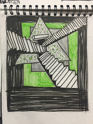
I really like these concepts, I think it works really well to communicate the theme of psychedelia and alternate perception. I like the balance between solid block shape and line work this could be really effective when printed, slight over-lapping and miss print of the layers could work well with the designs. The stairs represent walking through different doorways of perception, I like how they tangle together and merge with other shapes into an abstract geometric formation. I think this could make an interesting screen printed designs, there is a lot of potential ways the colours and layers could be worked around these designs.


No comments:
Post a Comment