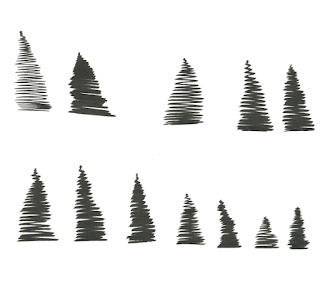
Adding images with Photoshop:
- These are the drawing of trees I scanned in and added into the landscape. I combined them together and re-sized them to get natural looking clumps of trees.
Floor:
- I sketched some textures for the floor. I liked the look of circles that got smaller toward the top, this would keep the perspective of my scene looking correct.
- I like how thick soft pencil looked - grainy and rough, but I didn't think it would have the same effect when scanned in and manipulated on photoshop.
- I thought a bolder texture might be more appropriate.
- I felt this texture would be more appropriate and could be manipulated and resized on photoshop to fit into my landscape.
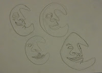
Moon:
- I tried some alternative moon faces. I came up with this one that had face at a slight angle. I like his scary grin, I think he will look good in my book.
Adding colour & texture:
- Id chosen on my colour combination before hand when working with paint pen, This was the colour pallet I chose on photoshop.
- Combining the separate scans of my book was difficult and took a lot of re-sizing and arranging to make it fit.
- After connecting up my scanned image I removed all the white from image meaning it was on transparent background.
- I darkened my outlines and made them solid black.
- I then added the colours, balancing them out across the buildings in ways I had practiced in roughs. Yellow was the key colour and was what the majority was coloured.
- Adding the floor caused me some problems. The black spots where to bold and overpowering.
- They gave a good perspective but didn't work in black. I tried them in grey which looked slightly better.
- I then added a lighter grey brush texture of the top of them which made them less flat and bold.
- I decided to make the entire ground area grey and have the spots a slightly different shade, This created a nice texture that wasn't to bold or over powering.
- This also made the characters stand out more against the ground.
- I experimented with some opaque colours for the sky.
- The pale yellow sky is my favourite, I think the pinky sky would also work but I feel like its more effective with a subtle sky. I don't want the sky to take away vibrancy from the buildings.
I was unsure on how to create my cover. I didn't want to have a cover that was loose around the book. I decided to add a cover onto the last page of my book so it would rap round onto the from of my book. I thought the first page of my book would make a good cover, if it had a suitable title added.
- I felt that hand done type would be best to match the visuals of my book.
- I sketched out a few title designs. This was my favourite, The shape of the font matches the style of the buildings.
- The scroll keeps to the medieval style of camelot.
- I wanted it to look as if it waving inwards towards Camelot from the gate.
- I coloured it matching to the buildings, leaving the scroll white.
- I looked at some varied placements for my title.
- This was the best, it had the right balance and leads you in towards Camelot.


No comments:
Post a Comment