Developing my idea:
After looking at some artist and reflecting on my mock up book. I wanted to develop some of the buildings I had drawn in my story boards. I needed to work bigger and sketch out some looser designs to get a feel for the shapes and pattern in the medieval style of Camelot.
- I tried including elements of the theme park, like the food court. But I wanted to let my way of drawing to take over the shapes I had learnt from the photographs.
- These where coloured with the flat nib ink pen. I like the scratchy and uneven effect they give. but I feel like the colours are slightly dull.
- It was a yellow ink but it appears more orange, I feel like the bright yellow gives a better effect.
- The panels and pattern parts of the building look good. I want to keep using these shapes and make them more abstract.
Paint pens:
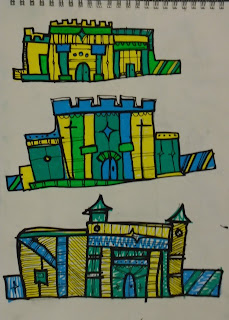
- I experimented with using paint pens to colour my designs.
- The colour quality is much more vibrant and solid.
- The blue, green/turquoise and yellow combinations looks good. I think it suites the theme well and is looking exciting and abstract.
- I like the way the buildings are warping. It looks characterful, I like the random structures better than the basic block buildings.
- These where quick sketches in pen and pencil, I was playing around with different shapes and structures for the buildings.
- I like the look of the long terrace buildings. They will work well stretching across my scene.
- I like how the lines within the building are getting denser and complex.
- Im really pleased with this, I like how the outline looks, it looks sharp and quick and works well with the paint pen. I want to consider this media for my final design.
- I tried a small scene with the same way of outlining. I like the look of, the atmosphere is right and the vibrant colours look work well against the textured surroundings.
- This sketches are bulgy and have different sorts of shape, I'm not sure I like them. I tried out having them on hills inspired slightly by the Mike Mignola sketch.
- These are funky and look very abstract. These have gone a long way from the others and I think I like the look of them. There are shapes from the theme park that have developed into more exciting patterns and structures.
Poster:
- We did a quick a poster in class a while ago that highlighted what our story was about and what happens.
- I put together some images that symbolise the story.


No comments:
Post a Comment