1. Which practical skills and methodologies
have you developed within this module and how effectively do you think you are
employing them within your own practice?
|
I have developed skills in storyboarding a direct
experience and learnt how to simplify a situation into a limited amount of
frames that explain it. I have also learnt how to think about how content can
be displayed within different dimensions and what will be most effective for
our chosen theme. I’ve developed methods in how I can record experiences and
places as a form of research. I’ve also developed methods using sequential
images within the same frame that explain movement and action. The final
construction of my printed book is a method I have learnt. I’m really pleased
with how it came together considering I didn’t use InDesign and figured out
the dimensions and folds myself.
|
2.
Which approaches to research have you found most valuable during this module.
How have you interrogated your research to identify appropriate ideas?
The most valuable research during this brief was
going to Camelot and experiencing it for myself. My whole project has been
based around what I did in that single day out. I really focused my research
into the place and its atmosphere and looked at how I could explain it with
appropriate images. Drawing from photographs was really helpful as a starting
point to get a feel for the aesthetic of the place. Photographing the area
was very helpful. It seems obvious but if hadn’t taken as many photos,
capturing the atmosphere of the place through drawings would have been
impossible. Getting out and about and experience stuff directly has been the
key thing by far. The story in my book isn’t exactly complex but its bold and
straight to the point (easy to read). I think this is because it really
happened to me and I didn’t feel the need to overcomplicate it. I feel that
confidence in an idea comes when you experience it personally. This has been
an eye opener to ways that we can interpret the world around us. Simple or
complex and make it exciting.
|
3.
What strengths can you identify within your submission and how have you
capitalised on these? What aspects of your submission are you satisfied with?
I think my strengths in this project have been tackling
with the dimensions and structure of the book. I used a concertina structure
to benefit my design. I’m pleased with how I made my book work as a
continuous scene. And also how I interpreted the characters and story within
it. I feel like my strengths also lie in the development of buildings in my
book. They came a long way from the observations of Camelot. The process used
to exaggerate and abstract the buildings where beneficial to my final
outcome. Using media to creating appropriate atmospheres. For example line
qualities and colour combinations that express a derelict surrounding, and
playful vibrant colours that are suitable for an exaggerated medieval theme
park.
|
4.
What areas for further development can you identify within your submission
and how will you address these in the future?
|
I wish I had worked with my design on Photoshop
sooner. It was a fairly late decision and but was appropriate for a book
being digitally printed. I feel like there were more digital experiments
needed in my project. I had to make quick decisions in my final book as time
was an issue and I had a print slot booked. If I had given myself more time
to experiment digitally I could have made my design better. I feel like my
final design drifted off coarse slightly. I am pleased with the end result
but looking back at some roughs I haven’t included and mark making or
scratchy line quality’s that add to the derelict feel of the area. The final
design looks very linear and simplified. What would my design have been like
if it had these line qualities?
|
5. How
effectively are you making decisions about the development of your work?
What strategies
informs this decision making?
I made the decision to construct my book from
drawings on Photoshop and apply digital colour. I’m pleased I came to this
decision. This gave the colours and line in the book a bold and vibrant
printed quality. I think I got slightly distracted by the dimensions and
structure of the book. I think occasionally during my projects I should step
back and ask myself if it’s going in the direction intended. But then again I
think its fun to see how I let the process take over the content I had gained
from my research.
|
6.
How effectively have you managed this project and organised yourself during this
module?
I think I managed my day trips effectively. I was
organized and went to a range of places to ensure I had good content to work
with. I feel have organized my development well and had good ideas where to
take the next step. I feel like more thorough reflection in my project would
be better, reflecting further back to past experiments and asking myself
critical questions about my progress. My time management was organized until
the end. I underestimated how much time and perseverance needed to construct
and colour an image the size of mine.
|
Friday, 22 January 2016
End of Modular Self Evaluation - Visual Narrative
Visual Narrative - Tell an untold story - Final Design
Final Design:
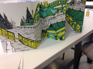
This is my final book. I decided to increase the size of the book to 190mm x 1710mm (including the cover). I thought I might aswell make the book bigger because my image was high resolution so quality no would be lost.
I didn't need to use indesign to create my book, I could print it straight away at the size it was and measure where to fold each page when printed.
I printed out 3 on the same roll incase any messed up whilst folding. Folding the book was difficult, I folded one book and the margin was out of line. The pages had to be exactly 130mm to make it rap round neatly. I used the folding press in the print room to measure out my pages, this allows you to set a size for the pages to be. This really helped with my design as there was no crop or fold marks.
Im pleased with how the finished print. The colours look bold and vibrant and the lines are strong and dark. Im pleases id decided to resize the book. I feel this is a good size for the book. The previous dimensions would have been to small - I feel it has more impact at a larger size.
Im really pleased with the flush margin. I wasn't 100% sure how it would rap around. Id taken a good guess at how big it needed to be but there was no way to tell how thick the folded book would be until it was printed.
There was one think that I hadn't thought about when designing the cover. Id originally intended for the double pages to be with alternate pages. Its hard to explain, but basically the last page ended up being the back cover instead. I don't think this is a problem its just not the way I intended the pages to be read.
Im pleased with the overall aesthetic to the book. I like continuousness and composition of the buildings. The story is also bold and obvious and I'm pleased with how readable it is. I am pleased with my decision making on Photoshop and I feel the book pulled together nicely. But I can't help but think now I'm reflecting back on it that it look slightly more linear and basic than i'd initially intended. Id slowly started to ignore some of the line qualities I had looked at to communicate the decay. My final has has a different aesthetic, more magical and fairytale like rather than derelict and abandoned.
Thursday, 21 January 2016
Visual Narrative - Tell an untold story - Photoshop
Adding images with Photoshop:
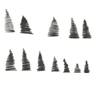
- These are the drawing of trees I scanned in and added into the landscape. I combined them together and re-sized them to get natural looking clumps of trees.
Floor:
- I sketched some textures for the floor. I liked the look of circles that got smaller toward the top, this would keep the perspective of my scene looking correct.
- I like how thick soft pencil looked - grainy and rough, but I didn't think it would have the same effect when scanned in and manipulated on photoshop.
- I thought a bolder texture might be more appropriate.
- I felt this texture would be more appropriate and could be manipulated and resized on photoshop to fit into my landscape.
Moon:
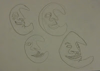
- I tried some alternative moon faces. I came up with this one that had face at a slight angle. I like his scary grin, I think he will look good in my book.
Adding colour & texture:
- Id chosen on my colour combination before hand when working with paint pen, This was the colour pallet I chose on photoshop.
- Combining the separate scans of my book was difficult and took a lot of re-sizing and arranging to make it fit.
- After connecting up my scanned image I removed all the white from image meaning it was on transparent background.
- I darkened my outlines and made them solid black.
- I then added the colours, balancing them out across the buildings in ways I had practiced in roughs. Yellow was the key colour and was what the majority was coloured.
- Adding the floor caused me some problems. The black spots where to bold and overpowering.
- They gave a good perspective but didn't work in black. I tried them in grey which looked slightly better.
- I then added a lighter grey brush texture of the top of them which made them less flat and bold.
- I decided to make the entire ground area grey and have the spots a slightly different shade, This created a nice texture that wasn't to bold or over powering.
- This also made the characters stand out more against the ground.
- I experimented with some opaque colours for the sky.
- The pale yellow sky is my favourite, I think the pinky sky would also work but I feel like its more effective with a subtle sky. I don't want the sky to take away vibrancy from the buildings.
I was unsure on how to create my cover. I didn't want to have a cover that was loose around the book. I decided to add a cover onto the last page of my book so it would rap round onto the from of my book. I thought the first page of my book would make a good cover, if it had a suitable title added.
- I felt that hand done type would be best to match the visuals of my book.
- I sketched out a few title designs. This was my favourite, The shape of the font matches the style of the buildings.
- The scroll keeps to the medieval style of camelot.
- I wanted it to look as if it waving inwards towards Camelot from the gate.
- I coloured it matching to the buildings, leaving the scroll white.
- I looked at some varied placements for my title.
- This was the best, it had the right balance and leads you in towards Camelot.
Visual Narrative - Tell an untold story - Final sketch
Final sketch:
- I'd decided on the dimensions 110mm x 160mm for each page. Meaning the whole page would be 1320mm x 160mm. I wanted to work with the exact size my book would be so I can figure out how everything will fit together smoothly.
- I had a thought that colouring my final design with paint pens when scanned won't look as vibrant. I thought it would get better result in my final print if I coloured the book digitally.
- I wanted to get my design outlined in a bold black pen and scanned in so I could work on it with Photoshop asap.
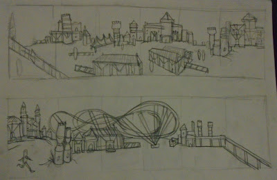
- I did one sketch that looked almost how I wanted it to but I just didn't feel the layout was quite right. I wanted the character to flow through nicely have a clear path where he walks.
- I did a second improved sketch that I was happy with, it was spacious in the path of the character and I had fences and barriers leading you on the way he walks, making it easily readable.
- Whilst sketching these designs I decided to have the rollercoaster weaving through the buildings and towers and leaving the page in the centre (where he bumps into security), this gives a nice balance to scene and intertwines all the buildings together.
- I put the security guards on the horizon in the distance as well as up close, this helps to suggest they are approaching him before he sees them.
- Getting my design as one long piece on screen will be difficult. I will have to connect it up perfectly on photoshop. I scanned it in four different sections ready to be edited on photoshop.
- I decided to add the trees and floor texture digitally so I could mess around with the layout.
- I figured that because my book was being digitally I might get a cleaner and bolder outcome if edited digitally.
Visual narrative - Tell an untold story - Further development
Further Development:
To get the running motion of the character I simply got up a picture of a stick man in a mid running position and simply built up my character around it.
Im please with these bottom two, they look mid motion. The way the foot is grounded and his leg is lifted up high behind him looks as if his on the run.
I tried using pattern hills in my scene. This looks good but I feel like it takes the attention away from the buildings a little bit. I like the look of the fence trailing into the distance. This is a good way to give my scenes perspective.
I had an edge to draw a moon with a face in the sky. I think it suites it. It adds to the make believe fairytale appearance. Like he is in a weird mysterious world where everything warped and twisted, with bright vibrant colours and usual perspectives. I feel like a moon with a face looking over the place fits pretty well.
Visual Narrative - Tell an untold story - Problem Solving
Problem solving with concertina:
Trying to figure out how the buildings will fit across a long scene was difficult. I needed to get the perspective right or it wouldn't work. I couldn't find a way to make it appear as if he's walking through it. I wanted it to flow nicely through all the buildings.
I also wanted the encounter with security to be obvious. I needed to make the encounter exciting. I thought about putting the security behind a building so my character can't see them at first and then he bumps into them when he passes them.
I like how these buildings are more built up and compact. They fill the space better. I tried merging the rollercoaster into the buildings, I still don't like the look of it. It doesn't sit nicely in the landscape. Having the gate and back wall at the same angle looks good and makes the place feel like its closed off and hidden.
Visual Narrative - Tell an untold story - Development
Developing my idea:
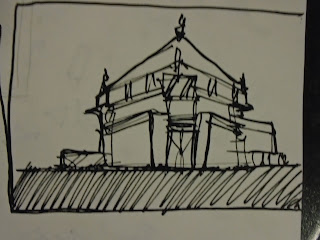
After looking at some artist and reflecting on my mock up book. I wanted to develop some of the buildings I had drawn in my story boards. I needed to work bigger and sketch out some looser designs to get a feel for the shapes and pattern in the medieval style of Camelot.
- I tried including elements of the theme park, like the food court. But I wanted to let my way of drawing to take over the shapes I had learnt from the photographs.
- These where coloured with the flat nib ink pen. I like the scratchy and uneven effect they give. but I feel like the colours are slightly dull.
- It was a yellow ink but it appears more orange, I feel like the bright yellow gives a better effect.
- The panels and pattern parts of the building look good. I want to keep using these shapes and make them more abstract.
Paint pens:
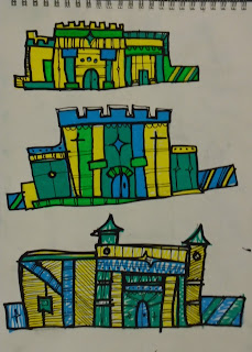
- I experimented with using paint pens to colour my designs.
- The colour quality is much more vibrant and solid.
- The blue, green/turquoise and yellow combinations looks good. I think it suites the theme well and is looking exciting and abstract.
- I like the way the buildings are warping. It looks characterful, I like the random structures better than the basic block buildings.
- These where quick sketches in pen and pencil, I was playing around with different shapes and structures for the buildings.
- I like the look of the long terrace buildings. They will work well stretching across my scene.
- I like how the lines within the building are getting denser and complex.
- Im really pleased with this, I like how the outline looks, it looks sharp and quick and works well with the paint pen. I want to consider this media for my final design.
- I tried a small scene with the same way of outlining. I like the look of, the atmosphere is right and the vibrant colours look work well against the textured surroundings.
- This sketches are bulgy and have different sorts of shape, I'm not sure I like them. I tried out having them on hills inspired slightly by the Mike Mignola sketch.
- These are funky and look very abstract. These have gone a long way from the others and I think I like the look of them. There are shapes from the theme park that have developed into more exciting patterns and structures.
Poster:
- We did a quick a poster in class a while ago that highlighted what our story was about and what happens.
- I put together some images that symbolise the story.
Subscribe to:
Comments (Atom)


