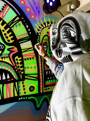
Im pleased with the selection of briefs that I chose for extended practice, I feel like they let me experiment with a diverse range of skills. At the start of the year I think I intended to work with mainly large scale mural based briefs, so i'm pleased that I tackled a range of different small scale printed briefs as well within this modular. Ways of applying my illustrations to different products is the most valuable and practical bit of learning that took place in the module. How I can work with different tools and process to achieve different visual outcomes, and what skills are appropriate to apply to the different tasks. Good practice for me within certain briefs was working around specific themes and looking at how I could communicate specific subjects within my illustrations, like the cactus themed mural, the outdoors screen print for add life and the selling sustainability live drawings. Engaging with topics within my designs was really beneficial to my overall illustration practice and has given me more confidence when needing to work with themes / topics outside of my usual interests. I can easily get stuck around working only within my own interests so working on briefs outside of my chosen themes has helped me gain confidence. Learning ways in which I can apply my known illustrations techniques and process too different kinds of visual subjects - this has helped me realise how I can apply my skills in a more diverse way. I find it tricky to decide on a brief / project that has been my overall favourite, each briefs have different strengths and weaknesses. Things like the 'Add.Life and Explore' and the 'Selling Sustainability' have easily been my most informative and subjective briefs. They involved a lot more development at early ideas stages to ensure they for-filled there purpose. Where as on the other hand my large scale commissions / murals and my experimental paintings didn't involve as much technical thinking as the other briefs but involved lots of experimentation with application of medias. I found these projects easily the most enjoyable, I feel at home with my practice when working with spray paint in this way. But the actual imagery within the designs are not as technically challenged as some of my other work. Aesthetically I am least happy with the flyer designs, but it was beneficial to work on them to figure out how event illustration could potentially become a big part of my professional practice. Seeing how my illustration designs could become part of clothing brand has been really useful for me and has given me good ideas for my future practice. Overall my biggest personal achievement throughout extended practice was gaining the amount of payed commission work that I did. It was good to get a proper sense of the sorts of work I would find my self working on the illustration industry. This module has been a good practice to lead me into my own line of work, and realise how to advertise and promote myself professionally.
Studio Practice
Thursday, 17 May 2018
Statement of Intent
Rationale:
I have chosen to work with a fairly wide range of different briefs for extended practice. The briefs will help me to figure out how my skills / designs can fit within different parts of the industry. I will be working on a really large scale to complete some mural briefs and other large scale commissions, also working on much smaller flyers designs as well as other printed and digital outcomes, and also smaller scale paintings. And experimenting with applying my illustrations to sellable products. The briefs will help me work towards a diverse portfolio of work that will help me realise best how my work can fit within different subjects each totally different selling points.Themes / Subjects:
- Character design, tribal, pattern, vibrant colours
- Street art / urban art
- Nights out / Events, dancing, party, speakers etc.
- Outdoor landscape, trees, hills etc.
- Sustainability
- Barbers shop
- Cactus
- Clothing designs
Products / Methods of Distribution:
- Flyers
- Posters
- Prints
- Large scale paintings / murals
- Painting on vehicles
- Clothing , Hoodies and T shirts
- Digital work
- Distribution online, on social media and my website
- Distribution / Promotion via exhibition and event work
- Posters
- Prints
- Large scale paintings / murals
- Painting on vehicles
- Clothing , Hoodies and T shirts
- Digital work
- Distribution online, on social media and my website
- Distribution / Promotion via exhibition and event work
Practical Skills / Media / Format:
- Screen printing- Lino Printing
- Pens, Drawing / Sketching
- Spray Painting / other large scale media
- Digital, Photoshop and Illustrator
- Research / Image referances
Brief 1 - Add.Life & Explore
Rationale: Produce a screen printed illustrations themed around walking / the outdoors, that will be used as part of big project / event. The artwork must communicate ideas of the outdoors and involve some of the specific activities that the organisation works with like walking, climbing, cycling and canoeing. Produce designs appropriate for a flyer, large scale banner and website design. Also some smaller illustrations to support the information. The final print will also be developed into a moving image on after effects to be used as extra promotion on the website.
Brief 2 - Event Flyer Illustrations
Rationale: Produce a range of different event flyers for some different nights in leeds. Try to communicate any appropriate themes of the events within the illustrations, also make sure the designs involve all of the information about the events. I will be working in collaboration with a graphic designer to complete the typography on some of the flyers.
Brief 3 - VW camper van
Rationale: Paint the entire exterior of Andy's VW camper van, exploring how my character creations can fill the space and work with the shapes of the van. The main aim being to effectively cover his entire van with my designs. Allowing me to use illustration designs within my own interests, The key thing in this brief being a text of my practical process skills (large scale painting on a 3D surface).
Brief 4 - Refuel Coffee Box
Rationale: A new coffee box opened up in leeds and they wanted artwork to cover the entire outside of the box. The colour scheme needed to be purple - other than that I was free too experiment with designs within my own illustration interests.
Brief 5: Neon Cactus
Rationale: Neon Cactus bar commissioned me to produce a cactus mural inside their bar. It needed to fill one of there downstairs walls. I chose to work with neon colours and to try and apply cactus features and characteristics to my own personal character designs.
Brief 6: Faulds Barbers
Rationale: I new barbers shop was opening and needed a new logo / brand identity creating. Colour scheme is grey, black, white and turquoise. He wanted the design to mimic a traditional barbers shop logo and involve symmetry and a classy typeface. As well as still having my own personal twist to the aesthetic.
Brief 7: Hoodies and T Shirts
Rationale: Print a series of hoodies and T shirts that are exploring how I can apply my own visual identity to them. How can I create designs and use my skills to effectively create a run of clothing. And how well do they sell as products? Could this become a good route for personal branding / merchandise.
Brief 8: Experimental Paintings
Rationale: Explore and experiment within a series of medium sized paintings. How can I apply the aesthetics apparent within my large scale work to paintings of a much smaller scale. I want to discover how I can translate between different sizes of paintings, and if there is any specific tools and media that will help me in doing so.
Brief 9: Selling Sustainability
Rationale: 'Creative Concern' commissioned me to come and produce some live illustrations as part of a project communicating sustainability. There where 4 large scale A0 boards that needed covering in live illustrations at a conference in London. There where 8 specific points that needed illustrating / explaining within the drawings across all of the boards.
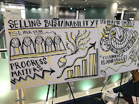
Extended Practice - 'Selling Sustainability' Live drawing in London
The Brief:
- 'Creative Concern' asked me if I was up for doing some live illustrations as part of project communicating sustainability.
- They where doing a presentation and a workshop at a conference in London and they wanted some live illustrations to be produce alongside it.
- The illustrations had to talk about a number of different ideas about sustainability that are spoken about in the presentation.
- There where 8 different points that needed illustrating and the idea was to have four plain A0 boards that would each get covered with 2 of the points.
- The brief gave me a number of different examples/images that could help me explain each of the ideas.
- They wanted the drawings to match the brand identity colours so I matched the colours as best I could with the specific inks that I used and order a fresh set of pens ready for the day. I also took a range of my own colours
- They also gave me some visual references to work from, It got me thinking about how I could apply my own illustration techniques to simple and linear, diagram style illustrations.
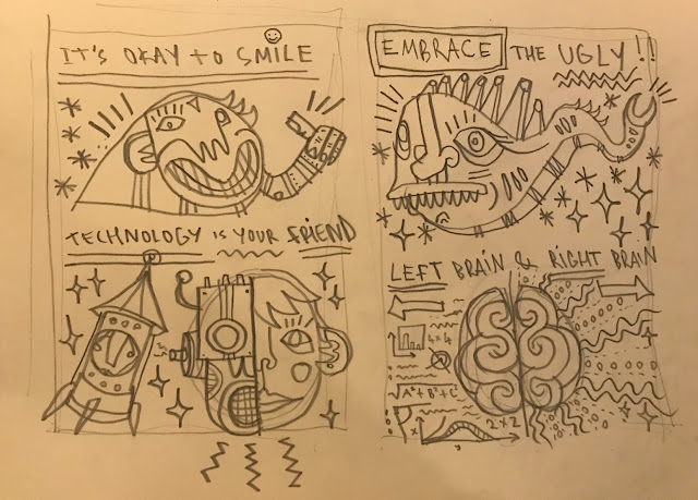
Sketches:

- I made some initial sketches to take with me on the day so I had a good idea of the layout.
- I took some good pointers from the brief as a starting point for the drawings.
Illustrating the points:
- Make the global local - A community of people stood on a globe, sun shining
- Reward and celebrate - A trophy, champagne popping, firworks
- Build your tribe - A group of connected characters with matching features and patterns
- Progress matters - An acorn growing into a tree, a graph suggesting progress, I needed some visual reference for this because was unsure...
- Its okay to smile - A character with a big smiley face
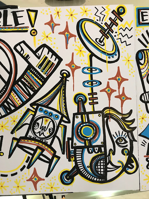
- Technology is your friend - A little rocket character, half robot half human face
- Embrace the ugly - A big ugly fish/slug character
- Left brain and right brain - Creative and mathematical sides of the brain, i used this picture to help influence my design...


- On the day the arrangement of the boards changed from portrait to landscape, and also 3 boards instead of 4. This meant I had to quickly figure out a slightly new composition - also didn't want to squeeze 4 different board design onto 3 so decided to get rid of the first initial design and just work with others.
Live Drawing:
Board 1:
Board 2:
Board 3:
- Working with more specific and explanatory illustrations in an almost diagram like composition is a totally different approach to what I have been doing with other commissions.
- Working in this way has opened up some other possible directions I could take my illustration skills.
- I liked seeing how my work looked in a more professional environment with such specific content - a lot of my recent work has been driven by own interests in design - so this felt like a more commercial and formal project.
- Aesthetically i'm really pleased with the work - I like how the drippy graffiti markers look when applied to this kind of design - its a very different approach to what I would usually take with this media.
Extended Practice - Experimental Paintings
- I have done a number of smaller experimental paintings across the space of the year. The main aim for the paintings was to try and achieve the aesthetics from my large scale mural work on a smaller scale.
- I found that I have 2 main approaches to my image making - my painted drippy and vibrant spray paint work and then my more print based and linear approach for smaller scale work. I wanted to see if could maybe tone my large scale painting style down to smaller designs as well.
- Im really pleased with how some of these paintings have come out, I like the drippy and messy effect created by the mixture of medias. I like using spray paint on this scale I think it translates well. I had fun experimenting with some different types of pens with different sizes and inks. One of my favourite discoveries was the super drippy and shiny white where I used a weird needle pen thing to draw it, I really like the effect of this.
- The key thing I wanted to take from these experiments into my practice was just the approach to the line work and shapes that these medias give me. I find my work like this is my most aesthetically pleasing I would like to see how these sorts of designs could maybe translated into more specific and informative projects / briefs as well.
Extended Practice - Printing Clothing
Making the Designs
- I wanted to a create a T shirt design that really communicates my visual identity and shows off my skills. I wanted to create an iconic face design, I wanted to combine my lino cutting skills with my more experimental drippy ink outlines.
- I wanted to create a 2 layer screen print and apply my colour blend techniques to it as well.
- I started by making a lino cut of a simple and shapey balaclava face, for an outline to sit on top.
- I produce loads of different quick outlines of faces in a thick ink pen that worked around the shape of the lino. There was something satisfying about the repetitive process here , I just kept drawing face after face until I had one I was really confident with and worked well with the lino shape.
Favourite face...
1st Layer, Colour blend...
Printed T shirts...
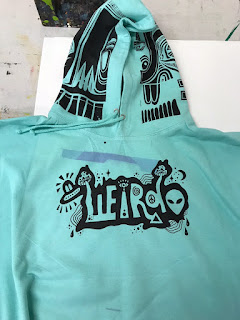
Lino prints for each side of the hood...
- I had been wanting too experiment with printing on hoods for a while now so this was the perfect opportunity.
- I made two different sidewards facing face designs for either side of the hoods, lining up the screens with the hoods and stretching out the fabric was the most difficult part about printing them.
Printed Hoodies...
- I printed all of my hoodies on light grey so I could apply the different colour blended faces to them.
Wierdo collaborations with Kieran...
Promotional Pics...
- The hood prints went down really well with people, I really liked how they looked and they gave my hoodies a good unique selling point - I think it was the hoods that drew a lot of the interest towards my clothes. Having a choice in colour blends was also a really good selling point, the fact each print was unique and slightly different from others made them even more desirable.
- Im really pleased with how popular the clothing was, I wasn't really expecting such I high demand for them via my instagram. It started of as an experiment but the more I started to sell I could feel it turning into more of a proper business idea. I kept ordering and printing more and more until I had to put a stop to it and try and organise myself properly. My next step is to try and get a proper clothing brand up and running - using my illustrative ideas as selling points for the clothes. The most important thing to take from all this is the fact that there is a market out there for these kind of products. So I need to continue experimenting with how my illustration work can translate into clothing products and other fashion.
- In future I would like to bring out another run of clothes but maybe using a different one of my initial face outlines. I would also like to try out some more hood designs and experiment with other areas of the hoodie I could print designs onto like the sleeves, pocket, back etc.
Subscribe to:
Comments (Atom)


