'Decks For Change' is a skateboard competition based in Australia, The competition is to create a deck design that communicates an issue or shows a positive change within your community. There is no real restrictions, apart from I think they prefer a hand generated aesthetic to a computer based.
Inspiration from cop last year:
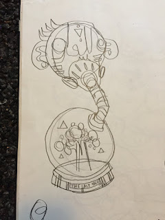
Last year in COP I looked at environmental illustrations and how illustrations and imagery can help to communicate issues. I looked at ways of communicating de-forestation and humans need for trees on the planet. I think this concept could work really well for this brief, I revisited the designs and looked at how I could make them more appropriate for a deck design.
First Roughs:
- I liked the concept but I wanted to re design the image completely. Even the line quality I want to be much looser and less rigid (quicker and energetic lines).
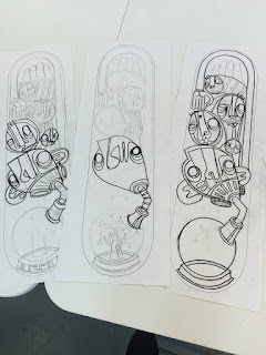
- I needed to change the composition to make it work for a skateboard, I could have it portrait or landscape. When sketching I found it worked much better as a portrait and could all the characters huddling behind each other, reaching up the deck.
- I needed to include the gas mask but I wanted it to be merged with one of my tribal faces, also not all of the characters needed to be wearing gas masks, only the one connected to the tree.
- The name of my design would be 'The Last Tree'. And would be showing our desperation for the tree and connection to it, whilst demonstrating very literally how we need trees to breathe (balance out the co2 in the atmosphere).
- They gave a template to submit the final illustration on. I printed out loads of small ones to sketch roughs onto, and help me figure out the arrangement and number of faces and how it would all be placed on the board.
- I liked the idea of having loads of little guys at the very top of the deck.
- I also decided to have a big arm that reaches around all the characters, like the guy in the mask is holding them all letting them breath, and also sticks to my recent theme of elongated arms that I seem to have created.
- I arranged the components so that the tank was at the tail off the deck and then the gap before the characters is where the trucks will go, so that the main big face is not covered up (if the design was ever to be used as a real skateboard).
- I decided I was going to screen print the final design, and put different variations of colour blend behind a black outline - and then choose the best one.
Problems with paint pens...
- I started outlining some of my sketches in paint pen. I wasn't happy with how they where looking because I felt like the pen dulled some of the immediate energy the quick pencil sketches created.
- I decided to not bother with the paint pen outline, and use one of my quick pencil sketches on its own too make into a positive, by scanning in and blackening the lines.
- I had been drawing them a massive scale with the intention to outlining with paint pen, Because I was going to use the pencil sketch on its own, I decided to draw on a smaller scale so that the outline would enlarge slightly in the screen print, and would be easier to sketch.
I started making the positives for this design, and colouring in the different sections. Something about this design I just wasn't happy with, Because I had been sketching out the same design alot of times, I was sure I could get it better so I couldn't bring myself to continue with this one.
Final Sketches
- Repetition is often a way that I refine my ideas, but has been used especially in this project. Not dwelling on the same sketch for too long and jump straight onto another sketch, taking things that I had learnt from the previous sketch.
- Because I wanted the outline to be quick and immediate, this was the perfect way to refine the design.
- I eventually got the sketched outline I was perfectly happy with, the characters where spaced out how I wanted them, none of them needed forcing into a space.
- All the pencil lines where clean and consistent across the deck.
- I also managed to get the words "the last tree" written cleanly across the bottom of the tank.
- I didn't draw on the circles that would be the leaves of the tree because I wanted to put them shapes on digitally to get them perfectly round. I did draw on the triangles because I prefer I hand drawn triangle shape.
Making Final Positive...
- I made the positives on photoshop, I used pink to colour in the design - this being where the colour blend will go. I quite like the look of it in pink already, I think I will try some colour blends in pink and purple colours.
- I also added some dots with the paint brush tool within the coloured layer.
- Because it was only going to be a two layer screen print, I left a lot of the features blank to help section up the faces and differentiate between the different features.
- I then turned all the pink too black and but it on a blank document, ensuring it was the exact same size as the outline. Ready to screen print!


No comments:
Post a Comment