Person of Note - Poster designs
Poster Designs:
- I decided to make my poster first, Its the biggest size and the ideas I've come up with so far are most suited to a poster.
- I wanted to decide on the best composition that emphasises the circular shapes and they work well with each other. That sort of suggest an orbit of the objects around the earth.


- My favourite composition is the bottom left. I like it all being symmetrical but then her head from an angle.
- The moon looks good plain with no detail and helps to maintain the space craft whilst the larger circle contains the head. These work well together and the line that shows the orbit fits well and breaks up the surroundings nicely. It also helps to show symmetry.
- Ive been thinking about a good way of producing the poster and screen printing seems to be the best I can think of for this type of design.
- It will give nice bold solid shapes and I will be able to get good quality colour and fill big sections of space.
- Also some of the un controllable effects like fuzziness and overlapping from screen printing might give a nice effect to the poster.


- I changed up the design a bit and made almost the whole of the large circle visible rather than just half.
- I think this looks better and the circular theme more obvious.
- I roughed out in pencil and pen how the light and dark colours could work together.
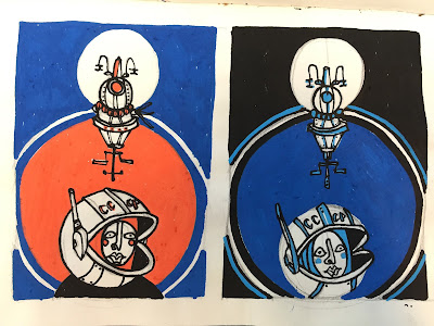
- I wanted the poster to be orange, black and grey. Or orange, blue and grey. Or just grey and orange or grey and blue. All would have white to from the paper colour.


- I used paint pens on simple pencil roughs to figure out the best colour scheme for the poster.
- I think both the orange and blue with the black background work best. The dark background adds to the spiciness and would look nice if a white margin is left on the design.
- I was surprised how well the light blue, dark blue and black work together. But I think the orange is needed to communicate her character and the Russian space suite style.
- In the final screen print I think I will make the black a dark grey instead of black and find a nice spacey blue maybe more turquoise, against a bright vibrant orange.


No comments:
Post a Comment