We have been asked to produce three editorial illustrations of an article we where given. The illustrations must visually communicate the article. They need to be sized: 200mm x 200mm, 105mm x 200mm (portrait) and 290mm x 105mm (landscape). We are able to use two colours and stock colour.
Ideas generation
My article was called danger mice and was about politicians and the government (in particular David Cameron) making up stories to the audience. I started by picking out key points in the article.


This concept was communicating the wrong message it suggests that David Cameron is as bad as hitler.


I revisited the idea of rich and poor separation. I looked at using a hand to separate them. I couldn't make this work as the hand looked out of place coming into the page. I also found it needed to have different visuals to represent the poor and the rich.


Pinocchio gave me the idea to have Cameron holding puppets. Suggesting the things he states are make belief. I didn't like the look of this concept. And i don't think the message I intended was clear.


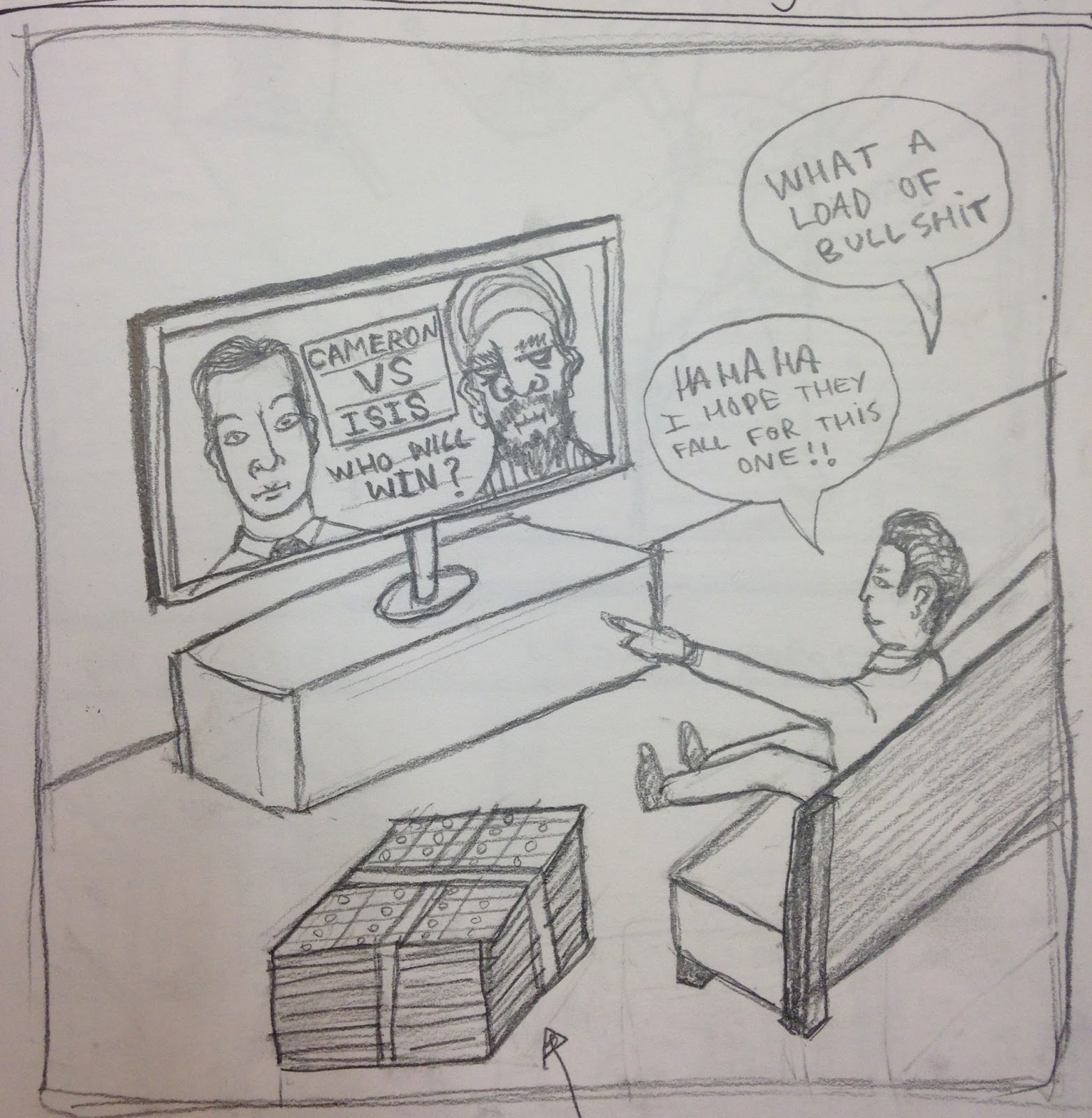
I had a final thought to put Cameron in a scenario that suggest he is causing economic segregation. By him throwing money to the rich whilst the poor is watching and reaching out for it. I also put him on a stand in the centre of the page that makes a barrier between rich and poor - representing the separation between the classes.

- Politicians are covering up real life problems with pretend threats from 'enemies'.
- David Cameron claims 'Islamic extremists' is the struggle of our generation.
- Real issues in the UK like climate change are getting ignored.
- David Cameron would rather act like he is fighting an enemy because it is grander and glamorous (also cheaper than solving real problems).
- The government is distracting us with fake and exaggerated issues.
- David Cameron talks about religious segregation in the UK, the only segregation thats happening is economic segregation (rich and poor) coursed by the government.
- More people are worried about climate change than islamic extremism.
- Cameron is distracting us with good guy vs bad guy bull shit.
I started by looking at how I can communicate a distraction through images. I felt there was to much going on in this image and wanted to simplify and refine it. This design only worked when using speech bubbles so I needed to explain it through imagery.

A key thing I picked up from the article was how David Cameron was trying to be heroic and glamorous but not doing a good job. I thought putting him in a child's superman costume would be funny and represent how he is not doing his job properly.

The article talks about economic segregation, I thought representing this in a literal way could be interesting. I like this as a concept but as an image is too plain and boring.


I looked at how I could show that David Cameron is ignoring problems that are happening all around him to save money. I drew him with his back turned looking smug with a handful of money. This idea was to obvious and I felt gave the wrong idea. I wanted my designs to be more jokey and less sinister.

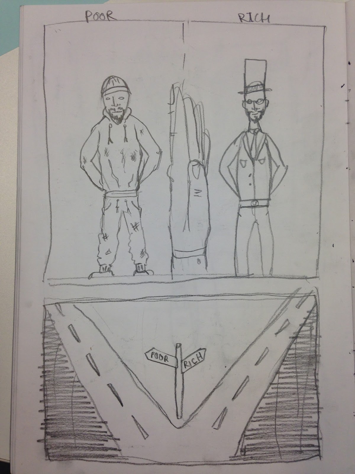

I revisited the idea of rich and poor separation. I looked at using a hand to separate them. I couldn't make this work as the hand looked out of place coming into the page. I also found it needed to have different visuals to represent the poor and the rich.

I tried to explain distraction by David Cameron holding up a sign towards the viewer. This idea did not work I couldn't get the perspective right and also the message did not look clear.

I looked at putting David Cameron sat with a terrorist having a pint. Suggesting that they are not really enemies. I didn't want to develop this concept any further because I felt it could communicate mixed messages to the audience.


In order for my illustrations to be effective I needed to capture David Cameron's face well. I drew it a number of times from a reference images and looked at how to represent his face with minimal lines. Also how to capture his face shape and hair style in a minimal way. I found his face was difficult to create because it is plain. His cheeks where the key thing I picked out to capture his face.


My most successful concept so far was the superman costume. I looked at different scenarios I could put him in to make it more effective. I wanted it to be funny and suggest that he thinks he is on top of the world and the centre of attention - this is then contradicted by the child's costume and the fat belly meaning he is not a superhero at all.
Somehow David Cameron had become the focus point to my concepts. I think this is because it makes it more relatable if there is a recognisable character in the designs.
Somehow David Cameron had become the focus point to my concepts. I think this is because it makes it more relatable if there is a recognisable character in the designs.
Pinocchio
The idea of Cameron as a superhero got me thinking about what other characters I could draw him as. The fact that he lies about things instantly made me think of Pinocchio. I looked at a picture of Pinocchio and could imagine Cameron's face as him straight away.


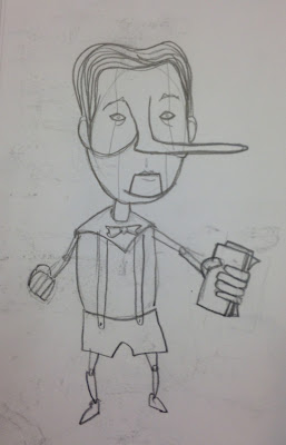
I started by putting a long nose on his face. This was amusing but i needed to develop it further and give him a body.


I looked at a picture of Disney Pinocchio and gave him a little body with wooden limbs.


The designs with a large exaggerated head where the funniest. I also wanted him holding money because its suggest what he's lying about, also connects it to the article.


Pinocchio gave me the idea to have Cameron holding puppets. Suggesting the things he states are make belief. I didn't like the look of this concept. And i don't think the message I intended was clear.


This was my favourite layout for the superman - Cameron, it displays him as very bold and powerful, but the way he is squeezed into a costume makes him seem ridicules.


I sketched ways of representing rich people, like top hats, feathers, cigars, canes, suites. I needed there to be a clear difference between the rich and poor side.
I found it really difficult to use my style of drawing to communicate a specific message. Making representational drawings of people and characters is new to me. Thinking of imagery that can communicate politics and David Cameron is also something totally out of my comfort zone. So this brief was hard to get my head around. I need to learn to use my own drawing process' to communicate a variety of different things.
No comments:
Post a Comment