Friday, 20 November 2015
Visual language - Mark making and Pattern
Mark making and pattern
We where asked to produce 15 mark making experiments using a subject. I stuck to the theme indigenous tribes. I found this image of a native american freaky looking doll whilst researching for my (vis skills) book cover. It has some interesting features like the hair and creased fabric, with the hands and face standing out I could really imagine some mark making and pattern used with this image.
I wanted to draw the image lots of times and manipulate as I go along. Looking at how to represent the image with patterns and marks.
I used a different sizes of pen for these. I did the lines quick a scratchy trying to discover interesting marks that would work.
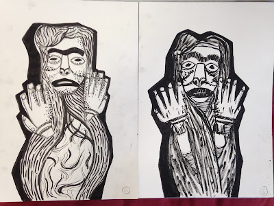
I experimented with some more controlled marks. the solid angular outline works well with more organic looking texture created by the ink brush pen. I also looked at some ways of adding tone using dots.
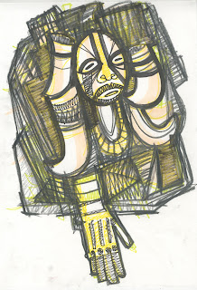
I was interesting in using different media in separate sections of the image.
My image had turned into this character. I used different tools to create the mark making in the different sections. I like the look of the patterns and marks being contained within thick outlines. I like the structure it gives the image.
Other experiments:
I looked at adding some tone using repetitive straight lines. I think I need to explore tonal mark making more, looking at more varied medias. I also need to look at colour and how I can apply it with these skills.
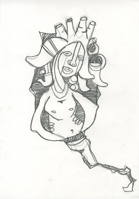
I had a go at using mark making with a character I created. I used the pen in a simple way being bold with where I placed the marks.
I looked at some scratchier rushed lines as a way of creating tone.
Visual language - Line quality (further explored)
Line quality - A3 experiments
I wanted try out some big quick gestural lines and work into them using different types of pen. The ideas came from my first 20 line drawings. I didn't need to look at a reference image at this point. I wanted to be experimental and interpret the shapes I had learnt different ways.


I simplified the line work down and focused on using a soft thick pencil and a paint marker. The pencil created an interesting shiny texture when worked over the black. I randomly drew the character with a wispy tale coming from his body, it looked like a genie and suited the tribal looking decorations, I liked the way it was starting to form.
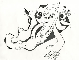
I feel this sketch sort of summarised the character I had created through this process. I didn't want to work into the drawing with any more medias, and it gave me the idea to try and draw it simplified with minimal lines and refine some of the shapes and line work I had learnt.
I think its interesting to think about how this character initially came from a photograph. How the features have been manipulated and developed into shapes that barley look like the photo, and have let my imagination take over.
I enjoyed working with simple lines, being neat and accurate with the abstract shapes worked really well. The black angular shadow behind them gives a nice surrounding and makes the shapes stand out.
I experimented with making a crazy two headed character. I could take the shapes I've learnt and apply them in all sorts of ways, the variations are endless.
I did this using quick straight continuous lines and overlapping them in areas. I like this way of outlining and could work well if put on top of colour.
I have found this process really helpful to discover new ways of producing line and also thinking of character designs. I founding working loosely and gestural benefits the way I draw. Working with the same shapes over and over is a good way to refine them and also abstract them. Building images from reference in this way is a skill I want to develop further and potentially use for some more specific briefs.
Thursday, 19 November 2015
Visual Language - Line quality
Exploring line quality
We where asked to draw with line only and no tone. We had to select one subject and draw it a minimum of 20 times. Exploring a range of tools and line qualities. I saw this task as a chance to try and create a character of my own by gradually manipulating the information drawn from the reference image.
This was the image I chose to draw. I really liked the shapes and string decoration in it. It looked really interesting to work with.
I started by drawing it as accurately as I could, not working into the lines to much.
Working with a really soft thick pencil really helped me understand the image and draw the shapes in a gestural and bold way.
I was starting to understand the image well and didn't really need to look at the reference image much at all. The lines here look refined and controlled.
I like the loose scratchy lines with the black boarder I think this works well.
I tried making a little character using the shapes I had learnt. I could really feel this process turning into an interesting character.
Im really like this one, I like the boarder and quick lines used to fill it in. The simple face with the complex decoration around the head looks good.
Whilst doing this drawing I felt really restricted and wanted more space to explore fast and scratchy lines like this and work into them with different tools. I decided to try working on A3 to do some larger experiments.
Subscribe to:
Comments (Atom)


